I created the Hare and Bird Superposition magic trick. You can get it at Raincloud Magic.
I can’t actually remember how the idea got started in my head. Sometimes I do think about old tricks and see if I can revamp them, so that might have been it, but I guess it doesn’t matter. The story is that one time, alright I confess.. one time sitting on the toilet, I got to thinking about the Hippity Hop Rabbits magic trick. It’s such a classic, and I had to wonder why. The reason has to be because it’s a sucker trick. They always play well. It’s built-in entertainment. It sure isn’t because of the look of the trick.
I can remember going into the magic shops as a kid, which is actually getting to be a pretty long time ago. Back then there wasn’t all these Chinese knock offs, there was actually quality on the shelves. The ones during my time were mostly made by MAK Magic. Back then they actually made their own products. I can remember those black and white rabbits sitting on the magic shelves. They had really big ones, and small ones, medium size ones. Some that had a wire across the ears, some that didn’t. The thing is, even as a child, I still remember thinking the black rabbit with the white outlines didn’t look right. It looked like a negative.
Then I got to thinking about an Indian set that had the imagines of the rabbits turned a little. They weren’t straight on, they had some character, and the cut out was asymmetrical. It still had the black rabbit with white outline, but the rabbits had a little more character than the usual straight on ones. I thought that was an improvement. It also had a way to steal off the shell piece without having to put your hand inside the box. I liked that too, but to show the box empty you did have stick your hand inside to hide the hook. But the main thing, and every version has it, is the lame finale. It’s different colored rabbits, which makes no sense. That’s when I began to try to make something out of my thoughts.
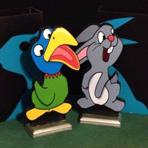
I first thought, that instead of different colored rabbits at the end, to have different animals. Then I thought about the asymmetrical profile of the Indian version, and I thought it would be interesting to fit different animals into a single outline. That’s when I thought about that ugly black rabbit with white outlines and thought it too should be another animal. Then I thought about what other animal should it be? What other animal do magicians use? The answer, birds. That’s when it became a rabbit and a bird, and then it dawned on me. Rabbit… bird… What about the rabbit and duck illusion? That’s when it fell all together.
I now needed four different animals that could work with the same outline. The first thing I did was to find a rabbit. I searched the internet and the one I liked the best was actually Thumper. Then I found a bird that would kind of work, then I found a goat. At that point, that’s all I could find. I then started taking those images and stretching them until they matched the same outline. Of course, by now the images were all distorted, but I never planned to use them. They were just to get an idea. At that point, I started tracing over them and creating my own versions on top of them. I did this with vector graphic software. That way I could scale it to any size without any quality loss.
I now had three cartoons that all had the same outline and I needed one more. I couldn’t think of any, so that’s when I hit facebook. I posted the images I had and asked if anyone could come up with another one. I got two responses. I feel bad that I can’t remember who sent me the turtle image, but if you are reading this, I did like it, and I still think sometimes of replacing the goat with it. The one that I went with actually came from my friend Scott Klinger. He drew out a rough sketch of a dog, and that was perfect. That’s when I did the same thing to it I did with the others. I traced over it with vector graphics software and made the dog.
Now I had to create the parts. Such a good idea needed some quality too. So I went with birch plywood. I used quarter inch for the main pieces, and eighth inch for the shells and boxes. The main thing is the characters. I drew the outline on an eighth inch piece of Masonite, and I cut it out. I wanted to do it on a thin and sandable piece of wood. That way I could smooth out all the rough cuts of the piece. Once I smoothed it all out, I used it to cut a half inch piece of plywood with the router, and that piece became my template. I used that template to route out all the pieces needed.
The boxes were just simple boxes, but they needed to have a hook in them and the inside covered with felt. I decided to make the hook all the way across. That way you don’t have to cover anything up with your hand. It just looks like the edge of the box. The hook is made out of brass plate, as is the hook on the characters. Both the brass plate and the felt has to be put on before the boxes are assembled.
Once the boxes are made and the cut outs are done, I blacken the edges with paint, and it’s time to put the labels on. I just have the labels printed at the local Staples. With the characters, I have to put them face down on a light table and place the template on it and trace it. If not, it’s impossible to get them on straight. I use spray glue 77 from 3M, and I use it as a contact cement. I spray the cut out and I spray the back of the label. Then, I get one chance to place the cut out on the label. That’s why I draw the outline. I learned real quick not to try to put the label on the cut out, but to put the cut out on the label. Doing the boxes are much easier.
Once the labels are on, they have to be trimmed. I use a razor blade. I slice around it, but I can only get so close. Not to mention that it’s rough. So I have to go around and sand the edge to trim the label paper flush. Now that leaves a white edge all around my painted black cut out edges. That means I have to go around with a marker and blacken it out. I must be very careful. One slip and their is a big black mark across the character. Have I done it? Yes. The only thing to do is to sand off the label and put another one on. It’s better just to take my time and be careful.
Once the labels are done, the boxes are together, the white edge is blackened out, I clear coat them all, and then I make my favorite part of the whole thing. It might not seem like much, but it really is, and that’s the base. Other versions have a large oversized base to keep them from tipping over. I wanted to avoid that, and the only way to do that is to make the base heavier. I made a base, made a mold of it, and now I can cast them in a mineral filled resin. The heaviness makes them smaller and allows the boxes to cover up the bases, and I just really like that. It helps everything. It looks better, and it’s even better for storage. Designing is always hard, and when I can’t figure out what color to use, I always take a left turn and go with a metallic. That’s why the bases are silver color, it’s neutral and it works. I just really like the bases.
That’s how the Hare and Bird Superposition came to be and how they come to be when I make them over and over. As for the name, what else am I going to call it? As I played around with some sort routine, I started thinking about quantum superposition’s where something is in two places at once. Rabbit and Bird didn’t sound very good, so I went with Hare. That’s the story, and that’s what it takes to make them. It’s actually one of the pieces of magic I am most proud of. I’m hoping it’s something that will go down in magic history. It always helps when magicians buy them. Hint Hint. You can get them here, if they are in stock… Raincloud Magic